Bronze: Behind the scenes
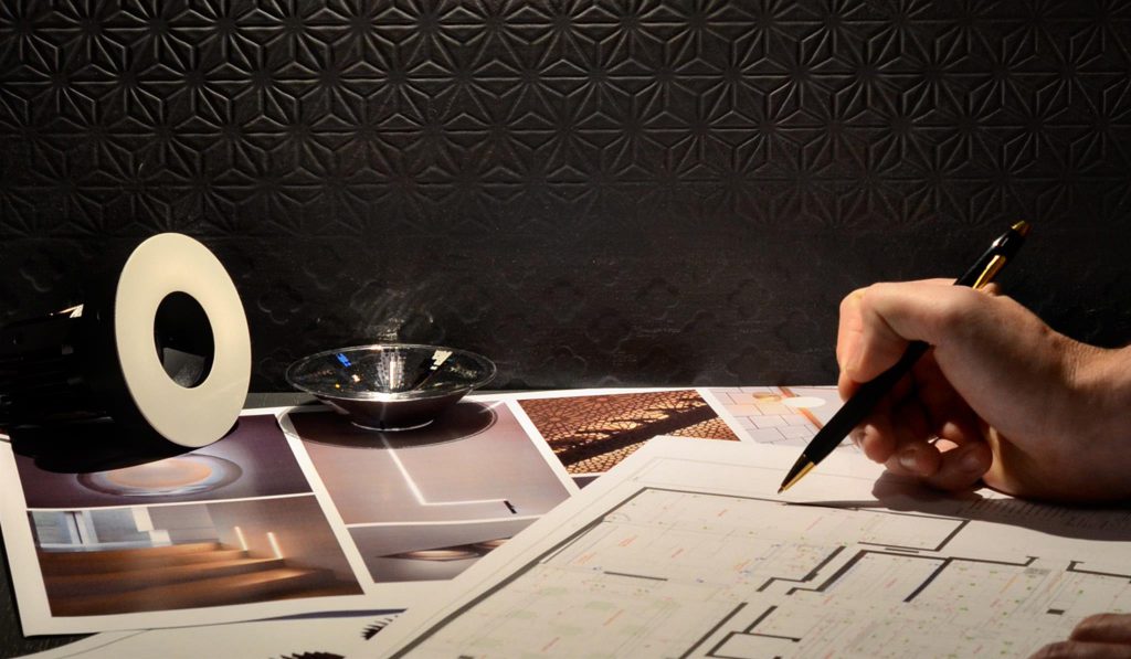
Jigsaw was chosen to deliver the lobby and concierge look and feel at Bronze. The beauty of the design and synergy with the Bronze architecture really stood out for us.
Strawberry Star caught up with Jigsaw for a Behind the scenes look at their work at our Bronze development.
What did you need to consider when approaching this project?
We always start with the location of each project, at Jigsaw we are very thorough in our area research, it is key not only that the design is coherent within the London Districts but that it is also tailored to the particular end users. Following extensive background research and by visiting the site we established that the location of the development is incredibly appealing to first time buyers, young professionals and buy-to-let investors thanks to the easy commute to the centre of town.
Where there any design constraints you needed to work around in this brief?
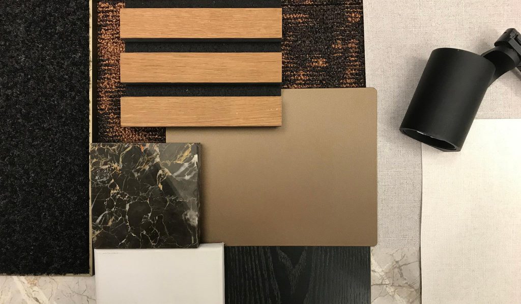
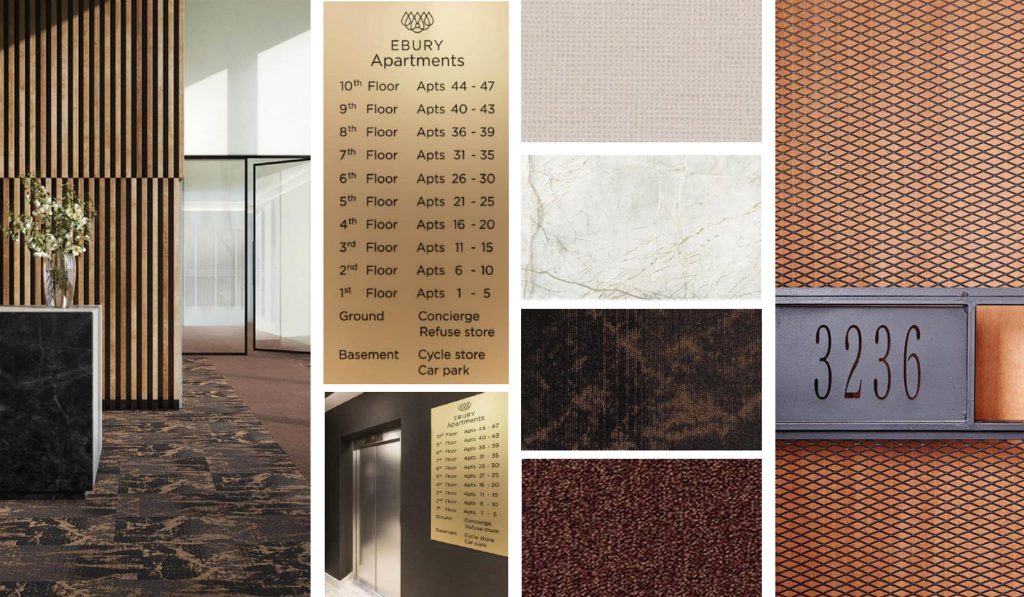
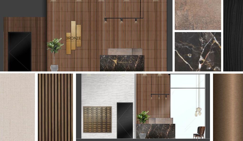
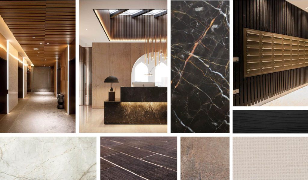
The entrance lobby has wonderful double-height ceilings, which can impact the acoustics of the room, so we had to bear this in mind during the product specifications. For durability, we selected a porcelain tile for the flooring and to prevent the space feeling echoey we needed to think of materials, which would absorb sound. Following a recent visit to a trade show, we came across the timber wall cladding which has acoustic backing attached. Similarly, wallpaper was added to multiple walls and sheer voiles added to large windows not simply for their aesthetic quality but also to aid sound absorption and soften the space.
How big is the team working on this project and what are the skills they bring?
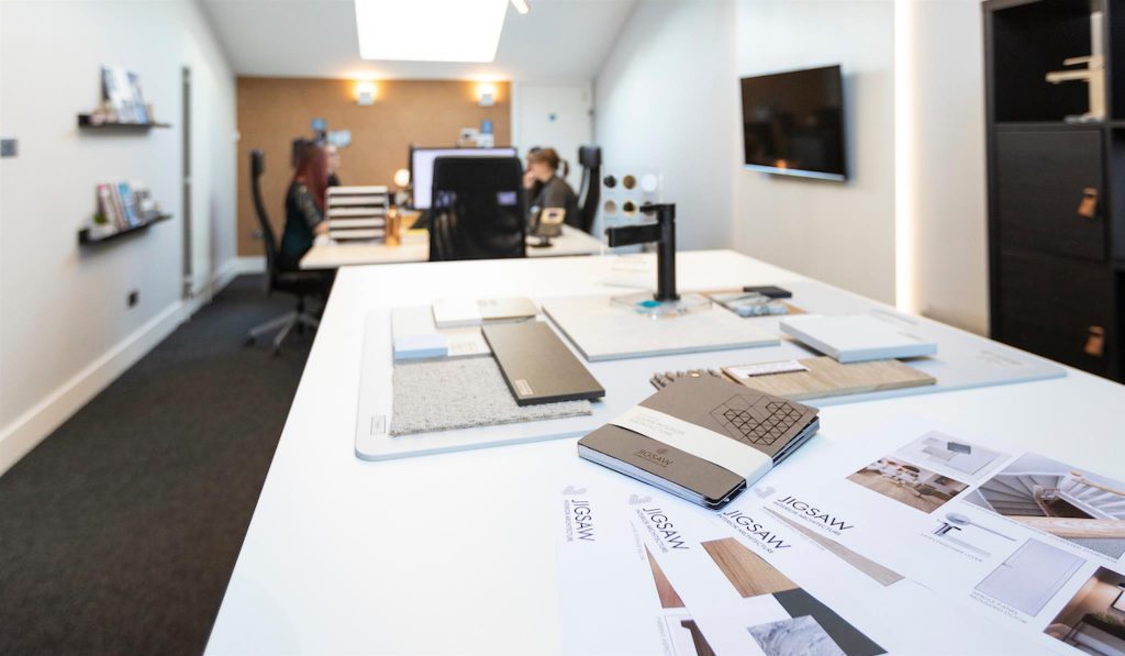
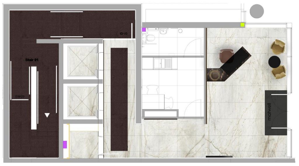
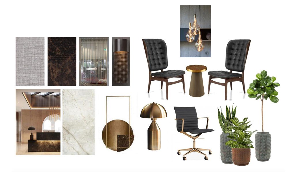
On this project, we worked with a team of 4 designers, Nathalie and Jenny on the interior architecture and Aless and Alix on the FF&E. The Interior Architecture department worked on specifying all the hard finishes and the technical aspects, wall and floor finishes, joinery and lighting design, and the Interior Design team looked at all soft finishes, loose furniture and accessories.
What was the inspiration for your design?
It came from the name of the development, “BRONZE,” and we also took inspiration from the development’s linear logo. The exterior of the building has bronze cladding, so we felt it was really important to reflect the outside within the design of the main lobby entrance.
Talk us through your creative process for this project.
As I mentioned before, it starts by considering the location, exterior specifications, future residents etc., but then it always emerges from the architect’s plans. The design must work spatially. We maintain a balance between design and style and the practical application of each space. Form and function working in perfect harmony.
What are the different considerations when designing a personal space versus a public space?
There are lots of different elements to consider when designing for a public space. Are the materials the correct fire retardancy? Is the scale of the furniture suitable? Are the materials durable enough to be used in a high traffic area? There are always constraints when designing any space, and we have to work with them. It’s not the case that as designers, we have more scope when working on private residential spaces. As often in the design of public spaces, we have the opportunity to be more creative and use items and materials that would not be suitable for a private home.
Have you used any sustainable or unusual materials?
During the design and specification selection process, the sustainability of materials is a consideration the Jigsaw team takes very seriously. We always try if we possibly can to find local products and manufacturers to reduce the carbon footprint. For this project, the timber acoustic wall cladding is manufactured using sustainable or recycled materials and the carpet tiles for the corridors are made of recycled fishnets.
Are there elements of current trends that you felt needed to be employed?
It is our job to keep one step ahead of the current trends within the industry, so we visit trade shows and showrooms to ensure we have in-depth product knowledge. Staying up to date is crucial in ensuring the relevance and longevity of our designs. This can be especially important in communal areas such as lobbies, which are designed years in advance and need to stand the test of time.
Do you have a preferred period or style of interior design reflected in this design approach?
No, I think this design hopefully transcends any one style and focuses on the beauty of the materials selected which convey the quality and luxury aspects of this build.
“We always tailor each design to the specific space so that no two projects are the same and each one perfectly suits its setting. We do not like the idea of imposing a particular “look” on a property that might not suit it. I would say however that Jigsaw’s signature is the careful attention to detail and consideration afforded to every one of our projects.”
Nathalie Serdons
Associate Director London
Founded in 2005 by Melissa Horne, Jigsaw has enjoyed considerable growth and is now a recognised leader in the emerging sector of Interior Architecture. Winning the best of Houzz, the studio has also been nominated for interior architecture at the What House and South Coast Property Awards. Some of their most prestigious projects include Westminster Quarter, a stone’s throw from the Houses of Parliament, and the Onyx Apartments in King’s Cross.


